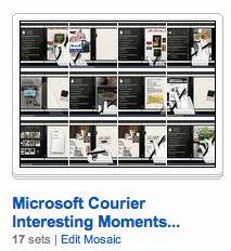
Microsoft Courier Interesting Moments & Design Patterns

I culled numerous screenshots from the video posted on Engadget in their article: Microsoft's Courier Digital Journal and have organized these into 17 sets on my Designing Web Interfaces flickr site. Each corresponds to an interaction pattern with individual keyframes to call out the interesting moments.
- Toss object onto another object. Opens a contact on a map.
- Hand swipe to change view. Finger flips pages, hand flips apps/views.
- Pinch closed to go to overview. Pinch closed to go from single view to multi-view.
- Tap button. Just as in iphone/ipad.
- Draw bound box to make handwritten notes into object. Interesting. Box a to do list. Then it is an object. Can toss contact on it to send the list to them.
- Pinch and spread. Open up a stack.
- Toss to add to page. Same as tossing object onto another object above, just a convention to add elements to a blank page by tossing them there.
- Flip over objects and make notes on back. Writing on the back is a cool idea.
- Hand swipe up to go back to other views (apps).
- Pull down Tool Area as Shade. Nice effect of the tool surface area pulled out further in the center. Looks like a fabric curtain shade being pulled down.
- Toss to save page objects.
- Tap Pen for Radial/Pie Menu. The pie menu!
- Hand Swipe to widen a view (1 page to 2 page). Interesting. A view/app is open on the right. Pulling it over to the left pane opens it fully. You pull with full hand swipe.
- Pull up page corner for configuration. This reveals a color/pattern swatch (stack of pages). Nice animations.
- Pull open folding tool palette. Like a folding room divider, it unfolds with tools.
- Send page (folds like origami and then sent flying). Take a page. Say send it. The page folds up into something similar to a postcard. Write the address (with the pen) on it and send it.
- Drag to Pocket. In the middle between the two panes you can drag items to the "pocket", flip pages, etc. and then drag them out. Reminiscent of trays in picasso, yahoo photos or just the clipboard.. Nice simple implementation.
- 2 individual panes. Perfect for book reading. Perfect for master/detail pattern (which is being exploited in the ipad as well).
- Pen, finger & hand gestures. Little wider input vocabulary as you advance in skills.
- Even more physicality than iPad (or at least it appears so if the video is really a true representation). When objects are selected, they move upward to a higher plane and float above the other elements. Using the z-index is a clever way to represent selection. When the elements break free of "flatland" they wiggle/wave like a flag as they move into position. The page that gets mailed, transforms itself into a postcard through a series of origami style folding.
- The pocket is really clever. Store stuff in the binder/gutter and move around then pull it out.
- The language of object on object meaning is also richer than the iPad (will the normal consumer understand this?)
- The use of the pie menu with the pen is a good idea. Pie menus have been shown to be efficient and seem natural in this interface.
- Returning to the pen. Being able to use the pen for finer pixel level manipulation is good (again, this is not as simple as just the finger, but provides more capabilities). Also being able to input with the pen (hopefully they nail this) should be faster than the keyboard for short spurts (don't have to leave the surface to begin writing).
- Gobbling while surfing. I am not sure if my former colleague Karon Weber has been involved in this project (she works on touch based interfaces at Microsoft with Bill Buxton). We did the Yahoo! Teachers project together and she & Samantha Tripodi designed the gobbler which I built. The premise was easily grabbing content from around the web and dropping it into "wells/objects". In the Courier this is made simpler by tossing into the right pane (the receptacle for the drop). The tossing seems pretty effortless and the landing target is huge (can you say Fitts law?)